

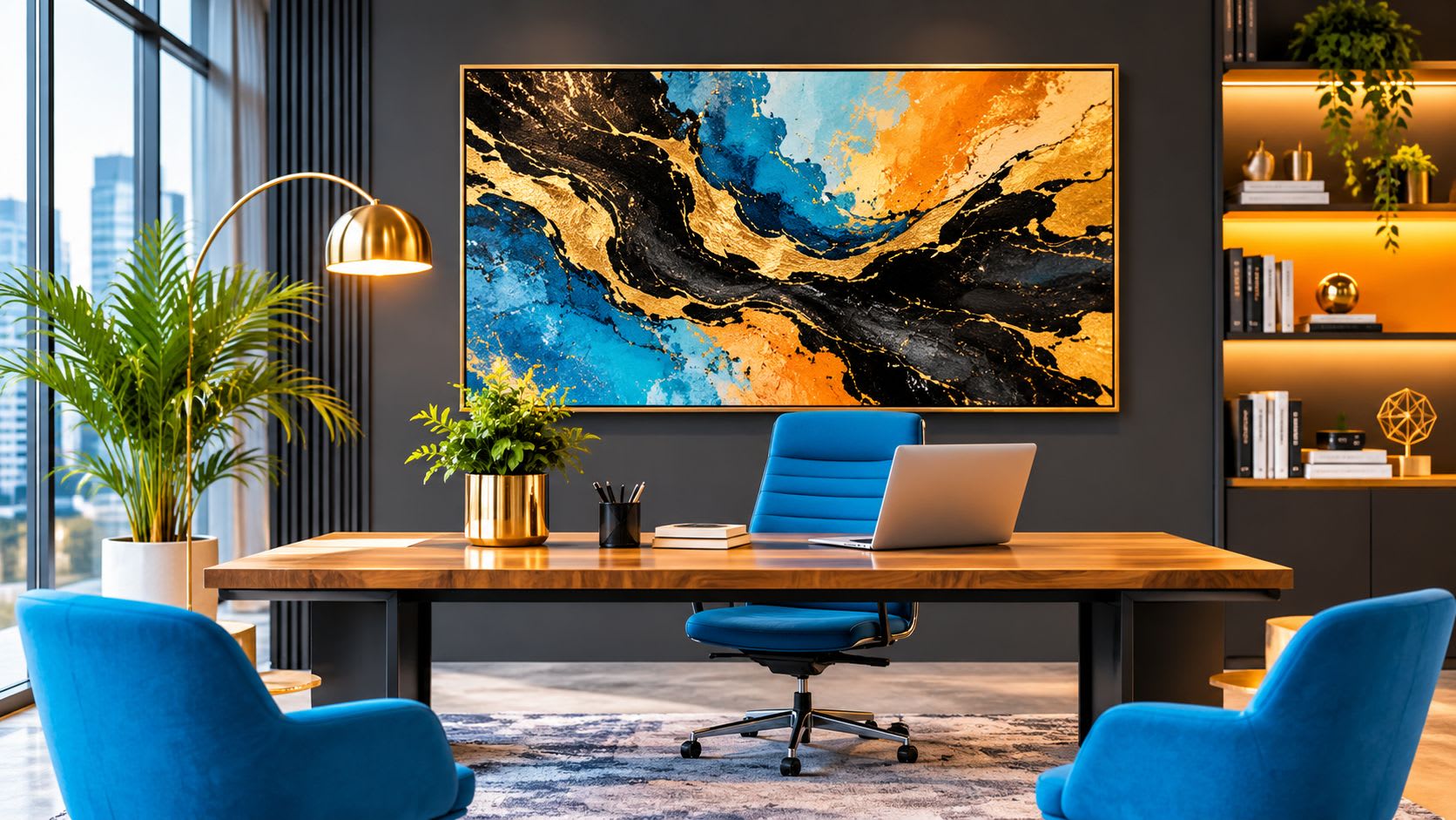
Abstract Black and Gold Painting: Design a High-Converting Agency Office
Why Does Your Agency Office Design Directly Affect Client Conversion?
First impressions form within seconds — long before you shake a client's hand or open your pitch deck, the room has already spoken. In a digital agency context, your physical environment functions as a silent salesperson, communicating brand values like boldness, precision, and premium quality through every design choice on display.
Environmental psychology research consistently shows that curated, intentional spaces increase perceived trustworthiness and make prospective clients more willing to invest in higher-fee services. When a client walks into a thoughtfully designed office, they unconsciously conclude that the team behind it applies the same level of care and strategic thinking to their work.
Wall art is the single highest-impact visual element in any client-facing room. It occupies vertical space at eye level, anchors the entire aesthetic, and communicates creative ambition in a way that furniture or lighting simply cannot. This is why selecting the right artwork is a strategic business decision — not merely a matter of personal taste.
Why Is an Abstract Black and Gold Painting the Ideal Statement Piece for a Digital Agency?
An abstract black and gold painting communicates sophistication, ambition, and creative confidence — precisely the brand values a digital agency needs to project to attract and retain high-value clients. The color combination works on a psychological level: black conveys authority and technical precision, while gold signals premium positioning and high perceived value.
The abstract style is a particularly smart choice for agencies serving diverse sectors — e-commerce, finance, luxury brands, startups. Because the imagery is non-literal and non-industry-specific, it resonates universally without alienating any segment of your client base. A bold abstract canvas avoids the visual clichés (stock-photo cityscapes, motivational typography) that instantly date a workspace.
Clients who are ready to invest in quality services are already attuned to signals of taste and discernment. When browsing curated collections of black and gold abstract wall paintings, you'll notice that the best pieces share a quality that transcends trend: the high contrast between deep black grounds and luminous gold marks creates visual impact even in large meeting rooms or reception areas, commanding attention without overwhelming the space.
Unlike many decor trends, black and gold abstract art has a genuinely timeless quality. It won't feel dated in two years, which matters when you're making an investment in your agency's physical brand identity.
What Size Abstract Black and Gold Painting Should You Choose for Each Office Space?
Size should always be proportional to the wall and the function of the room. Oversized art in a small space feels oppressive; undersized art on a large wall looks timid and accidental — both undermine the professional impression you're working to create.
- Reception area or entrance wall: Go large — 100×140 cm or bigger. A single oversized abstract black and gold painting here creates an immediate wow effect and sets the creative tone for the entire agency from the moment a client walks through the door.
- Client meeting room: A medium-to-large format (80×120 cm) works well above a credenza or on the wall facing clients during presentations. It stays in their eyeline throughout the meeting, reinforcing your agency's creative credibility on a subconscious level.
- Open-plan workspace visible to clients: A triptych or diptych of coordinated black and gold abstract canvases adds rhythm and scale without requiring a single massive wall — ideal for loft-style or open-plan agency spaces.
- Private director's office: Smaller formats (60×80 cm) positioned behind the desk create a polished, high-end backdrop for video calls — an increasingly important client touchpoint.
A reliable rule of thumb: the artwork should fill 60 to 75 percent of the available wall width to look deliberate rather than like an afterthought.
What Wall Colors and Interior Palettes Complement an Abstract Black and Gold Painting Best?
The most effective backdrops for black and gold abstract art are deep neutrals, warm whites, and charcoal tones — surfaces that allow the gold elements to glow without visual competition.
- Charcoal or dark grey walls: Create a dramatic, gallery-like effect where the gold in the painting appears genuinely luminous. Ideal for agencies positioning themselves in the premium or luxury segment.
- Warm white or off-white walls: The classic choice. Keeps the space feeling open and airy while letting the painting's contrast carry the full visual weight.
- Deep navy or forest green accent walls: An unexpected but highly effective pairing. The dark richness of these tones makes the gold elements in a bold abstract painting pop with remarkable intensity.
Avoid cool grey with blue undertones (it flattens gold), stark clinical white (it cheapens the art), and any busy patterned surface that competes with the painting's own texture and movement. For furniture, dark wood, matte black metal, and white lacquer all complement a black and gold canvas without creating visual noise.
Where Exactly Should You Hang an Abstract Black and Gold Painting in a Client-Facing Office?
The three highest-impact positions are the entrance focal wall, the wall directly facing clients in the meeting room, and the wall behind the agency director's desk. Each placement serves a distinct strategic purpose.
Entrance focal wall: This is the first thing a client sees on arrival. A large abstract black and gold painting positioned here sets a confident, premium tone immediately and has the additional benefit of reducing perceived wait time — people engage with compelling art rather than checking their phones anxiously.
Meeting room wall facing clients: Clients spend between thirty and sixty minutes looking at this wall during pitches and presentations. A bold painting here continuously reinforces your agency's creative authority throughout the conversation, even when no one is consciously looking at it.
Behind the director's desk: This placement frames the agency leader as both authoritative and creative. It also functions as a powerful backdrop during video calls, which remain a primary client touchpoint for most digital agencies.
For hanging height, center the painting at 145 to 150 cm from the floor — standard eye level when standing. Lower this slightly when the primary viewing position is seated, as in a meeting room where clients will spend most of their time sitting across a table. Avoid walls with direct harsh sunlight, which can create glare and gradually affect the vibrancy of the canvas.
What Frame Style and Finish Best Suit an Abstract Black and Gold Painting in a Modern Agency?
For a digital agency, frameless gallery-wrap canvas or a thin floating frame in matte black are the two most effective choices — both signal contemporary confidence and align with the clean aesthetic most creative studios cultivate.
- Gallery-wrap (no frame): The canvas wraps around the stretcher bars, delivering a clean, museum-quality look. This works especially well for large abstract black and gold paintings where the art itself is the statement and any frame would only dilute the impact.
- Thin floating frame in matte black: Adds a subtle border that separates the painting from the wall, creating depth and a more structured feel. Ideal for medium-format pieces in meeting rooms where a slightly more finished presentation is appropriate.
- Gold or brushed brass frame: Can work beautifully to echo the gold tones within the painting, but use it sparingly — best reserved for a single hero piece in the reception area rather than repeated throughout the office.
Avoid ornate baroque frames (they clash with the modern abstract style), thin silver frames (they undermine the warmth of gold tones), and any plastic or lightweight frame that signals low budget to design-savvy clients.
How Does Wall Art Influence Client Perception and Trust in a Creative Agency?
Wall art influences client perception by providing tangible, immediate evidence of taste, curation, and creative judgment. When a client sees a carefully chosen, high-quality abstract black and gold painting on your wall, they draw a direct inference: this agency makes considered decisions. That inference transfers to how they expect you to handle their brand, their campaigns, and their budget.
The effect is amplified in agencies because clients are specifically hiring creative judgment. A bland or poorly decorated office creates cognitive dissonance — why would someone trust a team's creative vision if that team hasn't applied any creative vision to its own environment? Statement wall art resolves that dissonance before the first word of your pitch.
Premium abstract art also signals financial stability and longevity. Clients investing significant budgets want partners who appear established and serious. A single well-placed, high-quality canvas communicates this more efficiently than any credential on a slide deck.
Designing a client-facing agency office is ultimately an exercise in brand communication through space. Every surface, proportion, and object contributes to the story you're telling. A bold abstract black and gold painting — sized correctly, placed strategically, and framed appropriately — does more per square centimeter than almost any other design investment you can make. Choose deliberately, hang intentionally, and let the art do the selling before you say a word.
Want to publish a guest post on aamax.co?
Place an order for a guest post or link insertion today.
Place an Order