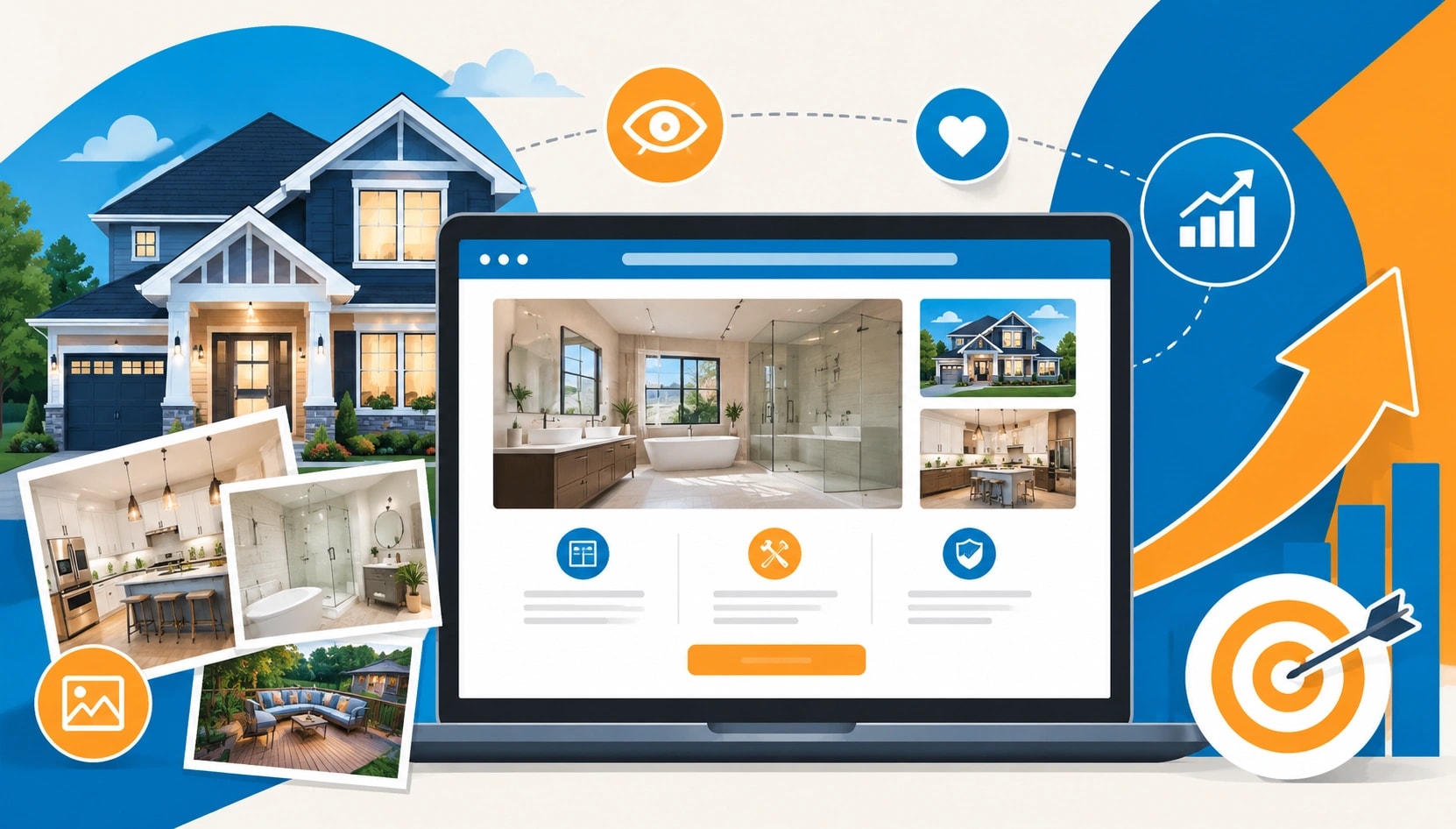
Why Visual Content Is Critical for Home Improvement Website Conversions
Home improvement decisions are deeply visual. A homeowner can read about premium materials, careful installation, or clever design all day, but the real question is simple: "Will this look good in my home?"
That's where strong visual content does the heavy lifting.
A website visitor might arrive with a vague idea. Maybe the kitchen feels dated. Maybe the backyard looks tired. Maybe the laundry room has become the place where good intentions go to die. Words help, but images turn a fuzzy thought into something real. They show shape, scale, finish, texture, and mood in seconds.
For home improvement brands, visuals aren't decoration. They're sales tools.
Trust Starts with Proof
People are cautious before spending money on their homes. Fair enough. A renovation, repair, or upgrade can be expensive, disruptive, and personal. Nobody wants to hire a company based on nice promises and a stock photo of a smiling couple holding paint swatches.
Real images build trust faster.
Before-and-after galleries, project videos, close-up material shots, and team photos all say the same thing without shouting: this business has done the work. It can show the work. It's not hiding behind vague claims.
One agency test on a contractor website saw contact form clicks rise after replacing generic banner images with real project photos. Not a massive redesign. Not a fancy animation. Just better proof. Sometimes conversion improvement is that boring. And that useful.
Visuals Shorten the Decision Process
Homeowners often compare several providers before making an inquiry. They scan. They judge quickly. They leave even faster.
A strong project image can answer questions that would take five paragraphs to explain. What does the finish look like? How clean is the installation? Does the style suit a modern home or an older property? Is the work neat around edges, corners, joins, and fixtures?
This matters even more for bigger investments, such as modular homes, where buyers want to understand layout, facade options, room flow, and how the finished structure might sit on a block before they commit to a serious conversation.
Visuals reduce hesitation. Less hesitation usually means more inquiries.
Good Photos Make Services Easier to Understand
Many home improvement services involve technical language. Subfloors. Cladding. Load-bearing walls. Drainage falls. Energy ratings. Waterproofing membranes. The list gets long.
Most customers don't want a construction lesson. They want enough clarity to feel safe making the next move.
Images simplify that. A diagram can explain a process. A short video can show installation stages. A labeled photo can point out product features without forcing the visitor to decode a block of text.
Simple wins.
For example, a decking company can explain weather resistance, hidden fixings, and board spacing in writing. Useful, yes. But a sharp close-up of composite decking beside a pool or outdoor dining area does something different. It lets the visitor imagine bare feet, weekend lunches, and a space that doesn't need constant sanding or staining.
That emotional shift matters.
The Right Visuals Support Better SEO Behavior
Search engines don't buy renovations. People do. But people's behavior can affect how well a page performs.
When visitors land on a page and find useful images, they often stay longer. They scroll through galleries. They compare projects. They click into case studies. They watch short videos. All of that sends helpful engagement signals.
Visual content also opens up more search opportunities. Image file names, alt text, captions, structured project pages, and location-based galleries can help a website appear for more relevant searches. The trick is to make visuals useful, not just pretty.
A photo called "IMG_4721.jpg" wastes an opportunity. A clear file name tied to the service, style, and location can support search visibility while helping the website stay organized behind the scenes. Tiny detail. Big difference over time.
Video Removes Doubt Faster Than Text
Video can feel intimidating for home improvement businesses, but it doesn't need to be overproduced. In fact, overly polished videos can sometimes feel less believable. A simple walkthrough of a completed renovation can work beautifully.
Show the room. Open the cupboards. Step onto the deck. Pan across the bathroom tiles. Let people see the finish under normal light.
That's enough.
Short videos also suit mobile browsing, which is where many homeowners first discover a service. Someone scrolling at night after work may not read a full project description, but they'll watch a 20-second transformation clip. Especially if the first frame shows a strong result.
Visual Consistency Makes a Brand Feel More Professional
A messy visual style can quietly damage trust. One page uses dark photos. Another has stretched images. A third shows stock graphics that don't match the service. The visitor may not consciously think, "This brand lacks visual consistency," because normal people don't talk like that. They just feel unsure.
Consistent visuals create polish.
That doesn't mean every image needs to look identical. It means the website should feel intentional. Similar lighting. Clean cropping. Clear image sizes. Real projects. Sensible spacing. A layout that lets the work breathe.
Home improvement websites should avoid visual clutter, too. Too many competing badges, pop-ups, sliders, and tiny thumbnails can make a page feel like a hardware store noticeboard. Not ideal.
The best pages guide the eye. They show the strongest result first, then support it with proof.
Before-and-After Content Is Still Hard to Beat
Before-and-after visuals work because they tell a complete story fast. Problem. Process. Result.
They're also satisfying. There's a reason people stop scrolling for a dramatic room makeover. The brain likes contrast. A dull patio becomes an outdoor entertaining space. A cramped kitchen becomes bright and practical. A plain facade suddenly has depth and warmth.
For conversion, this format is powerful because it makes the value obvious. Visitors don't have to imagine the improvement from scratch. They can see the gap between "before" and "after," then mentally place their own home into that story.
One tip: keep the angle similar. A before shot taken from one corner and an after shot taken from a completely different position loses impact. Same angle, same framing, clear lighting. Done.
Mobile Design Needs Visual Discipline
On desktop, a website has room to breathe. On mobile, everything gets tighter. That means visual choices matter even more.
Large images must load quickly. Galleries need to swipe smoothly. Text overlays should remain readable. Buttons should sit near the visual proof, not three scrolls away. Nobody should have to pinch, zoom, or play detective.
The mobile version of a home improvement website often decides whether a visitor stays or bounces. A beautiful desktop design won't save a clunky phone experience.
This is where smart web design and conversion strategy meet. The goal isn't to cram in every image from every project. It's to choose the right visuals, place them well, and make the next step feel natural.
Strong Visual Content Turns Interest Into Action
Home improvement websites convert better when visitors can see quality, understand value, and trust the business behind the work. Visual content does all three.
Photos prove the result. Videos show the experience. Diagrams explain the process. Galleries build confidence. Consistent design makes the brand feel professional.
Words still matter, of course. A good headline, clear service copy, and helpful project details all support the sale. But in this industry, visuals often make the first real impression.
And first impressions are stubborn.
Want to publish a guest post on aamax.co?
Place an order for a guest post or link insertion today.
Place an Order